
How to write custom reusable `App Bar` Widget in Flutter
I have a habit of developing utility apps for my own use, And I was old school so preferred jQuery and Bootstrap for developing until flutter came along, So I started developing the app which I used more frequently. Its a very simple app which has the collection of articles and news and manage my personal notes in one application. btw way you can install the app via play store [Link Note – Apps on Google Play] or view the buggy web app here: [https://linknote.ashrithgn.com/].
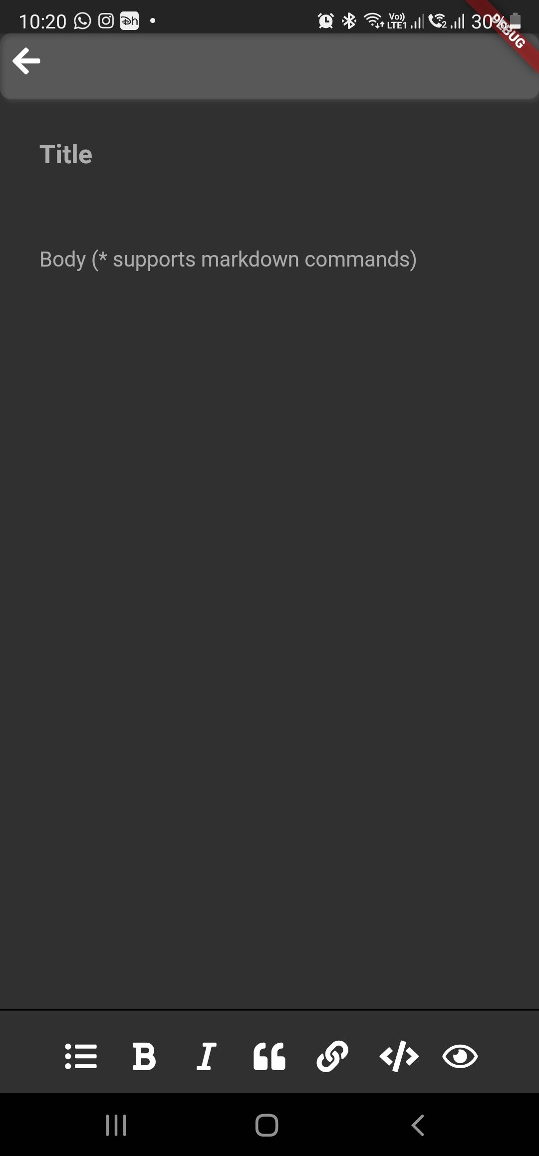
So as usual during the development first thing we need or add to an app is the App bar which handles the navigation. Flutter has decent App bar but I need to customize. And i was able to do so, So just instead of documenting it to myself i am wanted to share the code snippet in this article which might help some one to write or customize the Top app bar and bottom Navigation bar. Btw the snippet design looks like this
Just to know more about Top and bottom app bar
 Ashrith G N
So Enough of the introduction let begin with the our Top App Bar widget code.
// i have used Font awsome ICONs instead of Flutter Material icon

class MyTopbar extends StatelessWidget implements PreferredSizeWidget {
  @override
  Widget build(BuildContext context) {
    return SafeArea(
        child: Container(
            padding: EdgeInsets.only(bottom: 10),
            decoration: BoxDecoration(
              borderRadius: BorderRadius.circular(8.0),
              color: Colors.white10,
              boxShadow: [
                BoxShadow(
                  color: Colors.white10,
                  blurRadius: 2.0,
                  spreadRadius: 0.0,
                  offset: Offset(2.0, 2.0), // shadow direction: bottom right
                )
              ],
            ),
            child: Row(
              mainAxisAlignment: MainAxisAlignment.spaceBetween,
              children: [
                IconButton(
                  alignment: Alignment.centerLeft,
                  icon: Icon(FontAwesomeIcons.arrowLeft),
                  onPressed: () => {
                    if (Navigator.canPop(context)) {Navigator.pop(context)}
                  },
                ),
                //Place holder to add custom title
                Expanded(child: Container()),
                //You can add the other multiple icons need
              ],
            )));
  }

  @override
  Size get preferredSize {
    return Size.fromHeight(50.0);
  }
}
And now the bottom Code the snippet for the Bottom app bar
import 'package:flutter/material.dart';
import 'package:flutter_markdown/flutter_markdown.dart';
import 'package:font_awesome_flutter/font_awesome_flutter.dart';

class MyBottombar extends StatelessWidget
    implements PreferredSizeWidget {


 MyBottombar(//add the fields or the objects you need to control);

  @override
  Widget build(BuildContext context) {
    return Container(
        padding: EdgeInsets.only(top: 10, bottom: 5),
        decoration: BoxDecoration(border: Border(top: BorderSide())),
        child: Row(
          mainAxisAlignment: MainAxisAlignment.spaceBetween,
          children: [
            Expanded(
                child: FittedBox(
              alignment: Alignment.center,
              fit: BoxFit.scaleDown,
              child: Row(
                children: [
                  IconButton(
                    icon: Icon(FontAwesomeIcons.listUl),
                    onPressed: () {
                  	}
                  ),
                  IconButton(
                    icon: Icon(FontAwesomeIcons.italic),
                    onPressed: () {
                    },
                  ),
                  IconButton(
                    icon: Icon(FontAwesomeIcons.quoteLeft),
                    onPressed: () {
                    },
                  ),
                  IconButton(
                    icon: Icon(FontAwesomeIcons.link),
                    onPressed: () {
                      sendCursorToLast();
                    },
                  ),
                  IconButton(
                    icon: Icon(FontAwesomeIcons.code),
                    onPressed: () {

                    },
                  )
                ],
              ),
            ))
          ],
        ));
  }

@override
  Size get preferredSize {
    return Size.fromHeight(10.0);
  }
}
Now finally using these in the page
class NotesEditorPage extends StatelessWidget {

  @override
  Widget build(BuildContext context) {
    return _buildBody(context);
  }

  _buildBody(BuildContext context) {
    return WillPopScope(
        child: Scaffold(
          appBar: MyTopbar(),
          bottomNavigationBar: MyBottombar(),
          body: SafeArea(
            child: ()
          ),
        ),
        onWillPop: () async {
          //save
          return true;
        });
  }
}
Also Motivation on writing my app
Ashrith G N

